August 14, 2026
·
Updated September 1, 2026
·
12 min read
No Credit Card Required vs Card Upfront: Which Converts?
A conversion-focused comparison of “no credit card required” vs “card upfront” trials—clarify what conversion should mean for your funnel, weigh friction against buyer intent and trust, track the right conversion math, and apply UX/copy levers plus a clean experimentation playbook to decide.

If you’ve ever argued about whether removing the credit card field will “boost conversions,” you’ve already found the trap: which conversion are you optimizing for—signup, activation, or paid revenue?
This comparison walks you through when “no card required” typically outperforms, when “card upfront” is the smarter gate, and how to judge both with the metrics that actually matter. You’ll get practical UX and copy tweaks, plus an experiment plan that keeps your test clean and your decision defensible.
Decision Snapshot
“No credit card required” and “card upfront” are two different bets on buyer intent. One optimizes for volume at the top of your funnel, the other optimizes for commitment and cleaner handoffs to revenue. “Conversion” depends on which funnel stage you’re trying to improve, not just how many people click “Start trial.”
Define conversion
Conversion is not one number, and your best choice depends on where you bleed users. Track a small set of stage-to-stage moves, then decide which one you’re optimizing first.
- Visit → signup: landing-page to account creation
- Signup → activation: first “aha” moment reached
- Trial → paid: self-serve checkout or sales close
- Paid → retained: churn and expansion signals
- Sales cycle length: time to revenue, not time to signup
If you can’t name your bottleneck stage, you’ll optimize the wrong step and call it growth.
Two models overview
Both models can work, but they shape user behavior fast. Your UX patterns should match your pricing motion and the risk you’re asking users to take.
- No card required: email-first signup, later paywall, soft upgrade prompts
- Card upfront: trial with payment, “charge later” copy, fewer form steps
- Freemium: permanent free tier, usage limits, upgrade at constraint
- Demo-first: qualification form, calendar flow, sales-led evaluation
- Usage-based: metering shown early, billing setup sooner for serious users
Your “trial” is a product decision, not a checkout decision.
Quick choice cues
You’re choosing between lowering friction and increasing commitment. Use these signals to make a first-pass call, then validate with controlled tests.
- Choose no-card when activation is fast and self-explanatory
- Choose no-card when price is low and upgrades are impulse-friendly
- Choose card-upfront when abuse risk is real and costly
- Choose card-upfront when setup takes time and intent matters
- Choose card-upfront when your best users want continuity after trial
Match the gate to the risk: your risk, and the buyer’s risk.
Common misconceptions
More signups can be a vanity win if activation stays flat. A no-card flow can inflate weak leads, while a card-upfront flow can hide demand behind commitment.
Imagine two trials: one gets twice the signups but half the activation. Revenue may not move, and support load often spikes.
Optimize for downstream conversion and payback, or you’ll celebrate noise.
Why card gates matter
Card gates are not just a pricing choice. They’re a behavior filter and an operations lever.
The same form field can either remove anxiety or signal seriousness. Your conversion rate follows.
Friction vs intent
Asking for a card upfront changes what “starting a trial” feels like. It shifts the action from curiosity to commitment.
No-card trials attract more casual signups, including people who never planned to evaluate. Card-upfront trials shed that volume, but often raise the average intent per signup.
Your real question is which pipeline you want: more leads, or fewer but readier ones.
Trust and risk
Card entry is a trust test, not a typing test. People hesitate when they suspect surprise charges.
Billing anxiety spikes when your pricing page is vague, cancellation is unclear, or refunds feel like a fight. It drops when you show exact trial terms, renewal timing, and a clean cancel path.
If you require a card, make “no surprises” the product you ship first. For more on what shapes attitudes toward entering payment details online, see this study on improving consumer attitudes toward using credit cards online.
Trial experience effects
Card gating changes how users behave inside the trial. It sets a pace and a promise.
- Accelerates onboarding to “earn back” the commitment
- Increases pressure for fast time-to-value
- Reduces low-effort browsing of features
- Shifts exploration toward purchase-critical workflows
- Raises expectation for guided setup
If you take the card, your trial can’t feel like a sandbox.
Team implications
Card policy quietly reorganizes your internal workload. It changes what breaks, and who handles it.
- Fewer spam accounts, but higher fraud attempts
- More billing tickets about renewals and cancellations
- Earlier sales handoffs for high-intent accounts
- Increased chargeback and dispute exposure
- Stronger need for dunning and invoice workflows
Choose the gate your team can reliably operate, not the one that looks best on a slide.
When no-card wins
Removing card details works when your biggest drop-off is fear, not intent. You trade short-term payment certainty for more people reaching the product’s “oh, this is useful” moment.
The trick is staying honest about your funnel. No-card should increase meaningful activation, not just accounts created. In low-trust categories, pairing a no-card start with clear, verifiable trust signals—like a visible testimonial wall from real customers (e.g., via ShowTrust)—can move hesitant users from “sounds risky” to “worth trying” without adding more friction.
Low trust markets
No-card wins when buyers hesitate because they don’t trust you yet. New brands, regulated teams, and security-sensitive users see card entry as an irreversible commitment.
Imagine a niche security tool with an unknown logo. The product might be fine, but the billing form feels like a trap.
Lower the perceived risk first. Earn the right to ask for payment later. Practical ways to do that include surfacing credible social proof early—short, specific testimonials you’ve collected and curated—so prospects can sanity-check that people like them have succeeded before they ever see a payment screen.
Fast time-to-value
No-card trials work best when your product proves value quickly. You want users learning by doing, not debating a payment screen.
- Instant setup and first result
- Self-serve onboarding without sales help
- Clear “aha” moment in minutes
- Obvious next action after success
- Low initial configuration required
If value is slow, no-card just buys you more silent churn.
Top-of-funnel goals
No-card signup can boost activation, but only if you control the path to value. Treat signup as a doorway, not the outcome.
- Define one activation event tied to retention.
- Gate signup behind a lightweight intent signal.
- Drive the first session to one guided outcome.
- Trigger lifecycle nudges only after product engagement.
- Ask for card at the moment of proven value.
If you can’t name your activation event, you’re optimizing for applause, not revenue. And if you’re in a trust-sensitive market, make sure the pre-activation experience includes proof—not promises—so the “doorway” feels safe (for example, a small, relevant set of customer testimonials displayed prominently).
Freemium compatibility
Freemium plus no-card works when free usage creates a habit and naturally exposes paid limits. The upgrade should feel like removing friction, not paying to start.
It backfires when free tiers satisfy the core job or when teams can workaround limits. Then upgrades feel optional forever.
Design free to create momentum, then make paid the obvious next step. In practice, freemium funnels also benefit from trust reinforcement at the upgrade moment—showing a few curated testimonials about the paid outcomes can reduce the “why pay now?” hesitation without changing the product economics.
When card-upfront wins
Card-upfront can look like friction, yet it often boosts paid conversion by filtering out maybes. It also protects your team when trials are costly to run or support.
High-intent buyers
Card-upfront works when buyers already believe they have the problem and want proof you’re the best fit. Think urgent deadlines, active vendor comparisons, and a clear budget owner.
Imagine a team migrating tools this month. They’re evaluating three options, checking security docs, and counting seats. A card requirement signals seriousness and speeds the path to a committed evaluation, not casual browsing.
If your users are already in buying mode, the card is less a barrier and more a sorting hat.
Higher price points
Price and packaging can make “free to try” feel misleading, so card-upfront sets expectations early.
- Annual-first plans, not monthly-first
- Minimum seat counts or usage floors
- Heavy onboarding or implementation required
- High-touch support included by default
- Security or compliance reviews expected
When the purchase is a budget decision, qualification beats volume every time.
Abuse prevention
If your product is easy to exploit, card-upfront turns abuse into a paid problem.
- Block bot signups and fake accounts
- Reduce repeated trials with new emails
- Limit compute-heavy or API-heavy usage
- Deter scraping, spam, and outbound blasts
- Cut “trial-only” support tickets
If abuse costs you money, the card is a guardrail, not a conversion hack. Stripe’s guide to free trial abuse tactics and prevention is a solid overview of signals and progressive friction.
Shorten to revenue
Design the flow to qualify early without punishing real buyers.
- Ask for card after one clear value moment, not before onboarding.
- Show the exact charge policy in one line, above the button.
- Offer a tight trial limit tied to value, not arbitrary days.
- Add a fast escape hatch: sales chat, invoice, or demo path.
- Trigger upgrade prompts from usage thresholds, not nag screens.
Done right, your card gate becomes a commitment device that keeps momentum toward purchase.
Conversion math to watch
You can’t judge “no card” versus “card upfront” on sign-ups alone. You need funnel math that shows where friction moves, not whether it disappears.
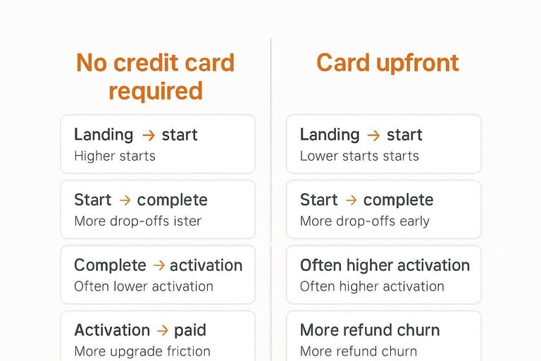
Track the same funnel stages for both models, then compare where each one “taxes” the user—this is the heart of conversion rate optimization.
| Funnel metric | No credit card required | Card upfront | Trade-off to watch |
|---|---|---|---|
| Landing → start | Higher starts | Lower starts | Intent vs volume |
| Start → complete | More drop-offs later | More drop-offs early | Where friction lands |
| Complete → activation | Often lower activation | Often higher activation | Motivation quality |
| Activation → paid | More “upgrade friction” | More “refund churn” | When payment happens |
| Support + fraud load | Higher abuse risk | Higher billing tickets | Ops cost per user |
Don’t optimize for the prettiest curve. Optimize for the curve your onboarding and support can sustain.
UX and copy levers
Friction and trust are the two dials you can always turn. The model sets the baseline, but your UX and copy decide how heavy it feels.
Reassurance messaging
People aren’t rejecting your product. They’re avoiding risk.
- “Cancel anytime” near the primary CTA
- “No charge until [date/event]” beside the card field
- Refund terms in one line, with details linked
- Security cues at payment points, not the footer
- Total price shown upfront, including taxes where possible
Place reassurance where doubt spikes, not where it’s convenient for you.
Form design choices
Forms fail when they ask for effort before you’ve earned confidence. Reduce fields, lean on autofill, and accept the payment methods your customers already trust.
Progressive disclosure helps when you need details later, like billing address only after card entry. Keep the first screen fast, then earn the next ask.
Timing and triggers
Pick a moment when the card feels like a fair trade, not a toll.
- Ask at signup when your product is inherently paid and simple.
- Ask after a value moment, right after the “aha” action completes.
- Ask before a premium feature, at the point of clear intent.
- Ask at a limit, when usage proves willingness and need.
The right trigger makes “why now?” disappear.
Offer structure
Your offer can offset friction without hiding the ball. Make the trade-off explicit and generous.
- Longer trial when setup effort is high
- Usage caps that let real work happen
- Credits that reduce first-bill anxiety
- Simple guarantees with plain-language terms
- Onboarding help for faster time-to-value
Use the offer to buy clarity, not to bribe confusion.
Microcopy and UI patterns for “no credit card” vs “card upfront”
Execution is where these models win or lose. Below are ready-to-use microcopy and UI reassurance elements you can drop into your flow.
A) “Free no credit card required” flow (remove suspicion, set expectations)
Primary CTA (pricing page / hero):
- “Start free — no credit card required”
- “Try it free. No card. No commitment.”
- “Create an account in 60 seconds — no card needed”
Secondary line under the CTA (answer the unasked ‘what’s the catch?’):
- “You can upgrade anytime from settings.”
- “We’ll only ask for billing when you choose a paid plan.”
- “Free plan includes [core outcome]; upgrade for [premium outcome].”
Signup form helper text (reduce perceived data risk):
- Under email: “We’ll only use this to create your account and send product updates.”
- Under password/SSO: “Use SSO to skip passwords.”
- Under submit: “No card. No sales call.” (only use if true)
UI reassurance elements (make ‘no card’ feel credible):
- Add a small badge near the CTA: “No credit card required” (not buried in FAQs)
- Show plan boundaries before signup (even a simple “Free includes X / Paid adds Y”)
- If you require a trial conversion later, say so upfront: “Add a card only when you upgrade”
B) “Card upfront” flow (make the trade-off feel fair and low-risk)
Primary CTA (be explicit about the reason):
- “Start free trial — card required (no charge today)”
- “Start trial — we’ll remind you before billing” (only use if true)
- “Unlock full access — card required to prevent abuse” (use sparingly; can backfire if it sounds accusatory)
Card-field microcopy (reduce fear at the exact moment it spikes):
- Next to card header: “No charge until you decide to continue.”
- Under card fields: “You can cancel anytime before the trial ends.”
- Under card fields: “We don’t store your full card details.” (only if accurate for your processor setup)
Confirmation screen (prevent ‘did I just get charged?’ panic):
- “You’re in. Today’s charge: $0.”
- “Your trial is active. Billing starts on [date] unless you cancel.”
- “Manage plan and cancel anytime in Settings.”
UI reassurance elements (clarity beats persuasion):
- Display “Today: $0” and “Later: $X / month” in the same module (not separate pages)
- Keep refund/cancellation terms one click away with a plain-language one-liner above the fold
- If you support multiple payment methods, show the icons before the form to reduce surprise
One rule for both models: never let the user infer key terms. If it’s “free no credit card required,” say when/why billing ever happens. If it’s “card upfront,” say exactly what happens today, what happens later, and how to stop it.
Experimentation playbook
You’re choosing between friction and risk, so test like revenue matters. A clean plan gives you a confident call without accidentally training users to wait for a better offer.
Pick primary KPI
Pick one north-star metric that matches how your business actually gets paid. For most SaaS, that’s paid conversion within a defined window, or activated trials that reliably lead to payment.
Set guardrails so you don’t “win” by breaking something else.
- North-star: Paid conversion rate, or activation-to-paid.
- Guardrails: Refunds, chargebacks, support tickets, sales cycle length, churn signals.
- Quality checks: Activation depth, first-value time, plan mix, discounts used.
If your north-star isn’t tied to cash or retention, you’ll optimize for vanity and regret it later.
Design clean tests
Use a setup that isolates the credit-card decision and nothing else.
Segment results
Average lift hides who you’re really attracting and who you’re losing.
- Acquisition channel: paid search, organic, partners.
- Geography: country, region, currency context.
- Company size: self-serve vs sales-led.
- Use case: core workflows vs edge cases.
- Returning users: prior trialists, reactivations.
- Device: mobile vs desktop.
If one segment drives most revenue, let that segment decide the policy.
Decide and roll out
Decide with pre-set rules, not post-hoc storytelling. For example, ship the winner only if the north-star improves and guardrails stay within your acceptable range.
Roll out in phases to limit blast radius.
- Start with a small percent of new signups.
- Expand by channel or geo, not randomly across everything.
- Hold back a control group for a short period to catch reversals.
After launch, watch leading indicators first, then lagging ones. If support volume or refunds jump, pause expansion and fix the funnel, not the headline—use funnel analysis to pinpoint where conversion and quality started to degrade.
Choose the Model, Then Prove It With One Clean Test
- Define your primary conversion goal (activation, qualified pipeline, or paid revenue) and pick the single KPI that represents it.
- Choose the default model that matches your market reality: optimize for trust/time-to-value with no-card, or for intent/revenue efficiency with card-upfront.
- Apply the highest-impact UX levers (reassurance copy, minimal fields, clear timing/renewal terms) so the test compares models—not avoidable friction.
- Run an A/B test long enough to observe downstream outcomes, segment by intent/source/persona, and roll out the winner with a follow-up iteration plan.
Frequently Asked Questions
- Does “free no credit card required” still convert better in 2026, or has it become a trust red flag?
- It usually still lifts sign-ups, but you need to offset skepticism with clear trial limits, transparent pricing after the trial, and visible trust signals (reviews, security notes, and real product screenshots).
- How do I stop “free no credit card required” trials from attracting low-intent users?
- Add lightweight qualification like role/company fields, a use-case selector, or an activation checkpoint (e.g., complete one key action) before unlocking high-cost features.
- What should I put on the pricing page when I offer a free no credit card required trial?
- State the trial length or usage limits, what happens at the end, and the exact upgrade path in plain language next to the CTA so users don’t assume a hidden catch.
- Can I offer “free no credit card required” and still capture payment details later without hurting conversions?
- Yes—ask for the card at a moment of demonstrated value (feature gate, usage threshold, or team expansion) and explain the benefit users get immediately by upgrading.
- What’s the best way to build trust on a “free no credit card required” signup page?
- Use credible social proof (named testimonials, logos with permission, and a link to a public testimonials page) close to the CTA; a tool like ShowTrust can help you collect and display those testimonials consistently.
Turn Trials Into Trust
Whether you choose no-card signup or a card-upfront gate, conversion lifts come from reducing uncertainty and proving value fast.
ShowTrust helps you capture and publish credible testimonials that answer objections instantly, so more visitors feel safe starting—and sticking with—your free no credit card required flow.
Written by
ShowTrust
Notes from the ShowTrust team on collecting testimonials and building authentic social proof.
Share: