August 11, 2026
·
9 min read
9 “No Credit Card Required” Mistakes That Kill Trial Starts
A practical troubleshooter for diagnosing why “no credit card required” trials don’t start—funnel triage and segmentation, hidden payment gates, signup and verification friction, clearer trial terms, and password/SSO fast paths that remove silent blockers.

Your pricing page says “no credit card required,” but people still bounce at signup—what’s actually stopping them? Most trial drop-offs aren’t about demand; they’re about tiny moments of friction that feel like risk, work, or a bait-and-switch.
This troubleshooter helps you pinpoint the exact step where users quit, reproduce the failure, and fix the most common culprits: accidental payment gates, overloaded forms, email verification dead-ends, unclear trial terms, and login/SSO obstacles—so qualified visitors can start using the product quickly.
Triage the Drop-Off
You can’t fix “no credit card required” trial starts until you know where they die. Treat it like debugging, not brainstorming.
Map the funnel
Define the path from first click to first win, and mark the exact exit points.
- List every step from click to first success event.
- Add the page or screen name for each step.
- Attach the tracking event you expect at each step.
- Pull drop-off counts between steps, not just totals.
- Circle the first steep drop and start there.
Your “problem” is usually one step earlier than the metric you’re staring at.
Segment the traffic
Averages hide the culprit, especially with mixed channels and devices.
- Split by device type and OS
- Split by browser and version
- Split by geo and language
- Split by channel and campaign
- Split by intent keywords and ad copy
Fix the segment that’s bleeding, not the one that’s loudest.
Reproduce the failure
You need first-hand evidence, not second-hand reports.
- Run the full signup on a real phone.
- Throttle network speed and retry key steps.
- Screenshot every confusing decision point.
- Record errors, timeouts, and loopbacks.
- Repeat with a fresh email and new browser profile.
If you can’t reliably finish your own trial, neither can your best prospects.
Confirm the promise
“No credit card required” is a trust contract, and small surprises break it fast. Check every touchpoint for sneaky gates like card prompts, phone verification that feels mandatory, or unclear limits that read like a bait-and-switch. Make the promise explicit on the landing page, signup, and the first in-app moment.
When the promise is clean end-to-end, users stop bracing for the catch and start moving.
Hidden Payment Gate
You can say “no credit card required” and still feel like you’re asking for one. It happens when pricing, plan choice, and upsells imply payment before users trust you.
You can spot the hidden gate by scanning each trial entry point for “payment-shaped” friction.
| Hidden gate signal | What users assume | Copy fix | UI fix |
|---|---|---|---|
| Pricing grid before signup | “I must pick a plan” | “Pick later during trial” | Default to “Trial” |
| “Start free trial” on paid plans | “Trial is paid soon” | “Start free, no card” | Add “No card” badge |
| Checkout-style layout | “Payment step is next” | “You won’t be charged” | Remove payment icons |
| Upsell modal on first click | “They’ll pressure me” | “Skip, keep free trial” | Add visible “Skip” |
| “Billing” in the signup flow | “Card details required” | “Billing later, optional” | Rename to “Plan settings” |
If the page looks like checkout, your users will act like it’s checkout—especially when your UI violates basic payment UX standards, and it can quietly drag down results even in disciplined conversion rate optimization efforts.
Signup Form Overload
Your trial signup should feel like creating an account, not applying for approval. Every extra field signals sales friction, even when you mean well.
Trim the form, keep identity clean, and move routing later. You can still qualify users after they’re inside. If you need to build trust without asking for more upfront, lean on verifiable social proof elsewhere on the page (for example, a small set of curated customer quotes from a tool like ShowTrust) instead of adding “just one more” field.
Cut to essentials
You need a real identity and a secure way back in. Everything else can wait until the user has momentum.
- Email + password, or SSO
- Name only if necessary
- Remove phone and company size
- Move role and title later
- Ask billing address never
If it reads like a lead form, people treat it like one and bounce. If you’re tempted to keep extra fields to “filter” for serious users, it’s usually cleaner to keep signup light and let credibility come from trust signals on the page (like a few strong testimonials you can manage and rotate).
Delay the qualifiers
Qualifying questions work best when they pay the user back. Ask them after login, right before personalization or setup.
Imagine the first screen is “Create your workspace,” and the second is “Pick a template.” That’s where “team size” and “use case” suddenly feel helpful.
Tie every qualifier to an immediate upgrade in the product experience, or don’t ask it yet. You’ll often get better completion by using social proof to reassure prospects pre-signup, then collecting the details once they’ve seen value.
Fix validation traps
Validation should prevent mistakes without punishing intent. People quit when the form feels brittle.
- Relax password rules to the minimum your security team accepts.
- Show requirements inline before users submit.
- Use specific errors, next to the field.
- Preserve every input after an error.
- Validate as they type, not at the end.
Make the form forgiving, and your security posture won’t be the thing users resent. When the signup flow is smooth, you can keep the trust-building work outside the form itself (clear copy, privacy cues, and credible testimonials) rather than using extra validation or fields as a proxy for “quality.”
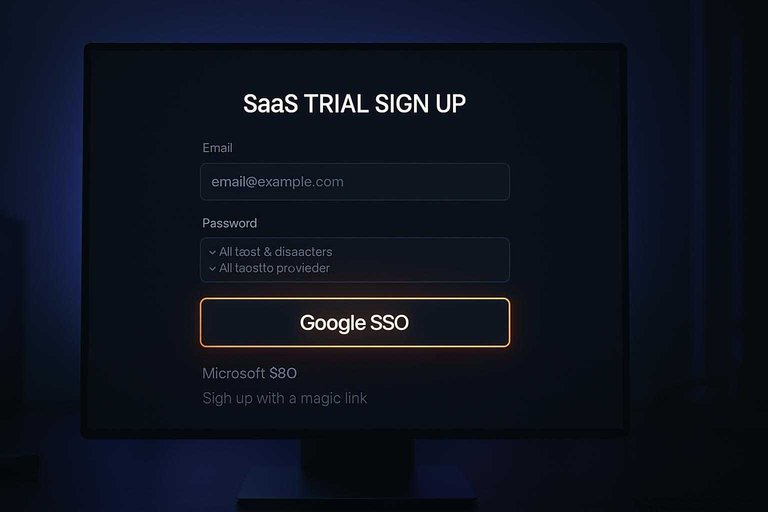
Offer fast paths
Some users will never type a password for a “trial.” Give them options that feel instant and safe.
- Google SSO for speed
- Microsoft SSO for work accounts
- Magic link for passwordless
- Plain copy explaining data access
- Fallback email signup visible
Fast paths aren’t just convenience; they’re trust signals at the moment trust is weakest. Pair them with lightweight proof nearby—e.g., a small embedded testimonial widget placed next to your trial call to action—so the user gets both speed and reassurance without you asking for more information upfront.
Email Verification Limbo
Email verification is supposed to protect you from bots and bad signups. In practice, it often traps real people in a loop they can’t escape.
Imagine a user who signs up on mobile, switches apps, and never sees your message. They come back later and hit a dead end.
Make delivery reliable
Your verification email is part of the product, not an afterthought. Make it predictable across inboxes, devices, and security tools.
- Authenticate SPF, DKIM, and DMARC
- Send from one consistent subdomain
- Avoid spammy words like “free”
- Keep the link short and readable
- Use a mobile-safe deep link
If the email doesn’t land fast and clean, your trial start never happened.
Reduce hard blocks
Hard gates feel safe, but they create friction at the exact moment intent is highest. Let people move forward, then verify before anything risky.
Give unverified users a “safe mode” experience:
- Let them see the dashboard and navigation
- Allow sample data and templates
- Block invites, exports, and billing changes
- Label locked actions with one reason
Security works better when users stay engaged long enough to finish verification.
Unstick the user
Most verification failures are recoverable, but your UI hides the recovery path. Add obvious escape hatches and reduce guessing.
- Add a prominent “Resend email” action.
- Let users change the email without restarting signup.
- Detect “already verified” and route them into the app.
- Show a resend cooldown timer and explain why.
- Put one clear next action on the screen.
When users can self-rescue, support tickets drop and trial starts rise.
Handle enterprise inboxes
Corporate email can be the harshest environment you’ll ever ship into. Filters rewrite links, quarantine messages, and hide anything unfamiliar.
Put help where users get stuck:
- A short “check quarantine” hint on the screen
- Whitelist instructions for your sending domain
- Guidance for aliases and plus-addressing
- An alternate method like code-based verification
Enterprise users won’t “try again later.” They’ll just move on.
Confusing Trial Definition
A “no credit card required” trial still fails when “trial” is vague. If users can’t predict limits or the ending, they pause and bounce.
State the terms
Users decide fast, and ambiguity feels like a trap. Put the trial definition where the decision happens.
- Duration: days, weeks, or “until used”
- Limits: seats, projects, storage, usage
- Included features: what’s in, what’s out
- End state: what changes, what doesn’t
- Location: near CTA and in signup
Make the terms impossible to miss, and hesitation drops.
If you want proof of how quickly vague flows drive exits, see Baymard’s checkout usability research.
Align product and marketing
Words are part of the product experience. If your landing page says “free trial” but the app says “demo,” users assume bait-and-switch.
Imagine signing up for a “trial” and seeing “request access” inside the app. You won’t keep clicking.
Name it once, everywhere, and you remove a silent trust leak.
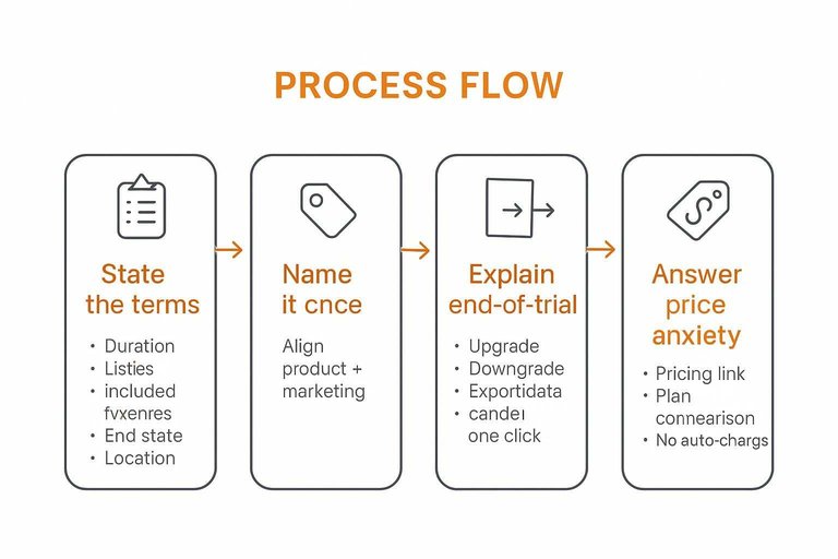
Explain end-of-trial options
People fear getting locked out of their work. Show the exits before they enter.
- Upgrade to keep full access
- Downgrade to a free plan
- Export data before limits apply
- Cancel with one click
When the off-ramp is clear, starting feels safe.
Answer price anxiety
Your “no card” promise isn’t enough if pricing stays hidden. Users want to know what they’re trialing toward.
Put a pricing link near the CTA, include a plan comparison, and say “no auto-charge” in plain language.
If someone needs a call to learn basics, you’ve turned a trial into a negotiation.
Password and SSO Friction
You remove the credit card, then block the signup. Password rules, flaky OAuth, and vague errors quietly erase trial starts.
- Require a complex password before value is shown
- Reject passwords without showing exact requirements
- Break OAuth in Safari or private browsing
- Hide SSO behind “enterprise” wording
- Drop users on a blank error state
Fix the failure path first, then polish the happy path.
Fix the Blocker, Then Re-run the Test
- Pick one high-intent segment (e.g., pricing-page visitors) and map the exact path to “first moment of value.”
- Reproduce the flow on multiple devices/browsers and inbox types, looking specifically for payment fields, form traps, and verification dead-ends.
- Make one change that removes a hard stop (not a cosmetic tweak), then confirm the promise is consistent across ads, pages, and product.
- Re-measure trial-start rate and top drop-off step, and repeat until starting a trial feels as effortless as the headline implies.
Frequently Asked Questions
- What does “free no credit card required” actually mean for a SaaS trial?
- It usually means you can create an account and start using the product without entering payment details up front. You should still check whether there are usage limits, locked features, or a required upgrade step before you can reach the key value.
- How do I increase trust on a “no credit card required” trial landing page?
- Add specific trust signals near the primary CTA—customer logos, short testimonials, security/privacy notes, and clear expectations for what happens after signup. A tool like ShowTrust can help you collect and embed verified testimonials so prospects feel safer starting a free no credit card required trial.
- Should I require a work email for a free no credit card required trial?
- Often yes if you sell B2B and need cleaner lead quality, but make the policy explicit and provide a clear error message plus an alternative path (SSO, manual approval, or “use any email” for self-serve tiers). If you block common domains, say so before users fill the form to avoid frustration.
- How do I track where users drop off in a no credit card required signup flow?
- Instrument each step as a distinct event (landing CTA click, form submit, verification sent, verification completed, first key action) and review funnel reports in GA4, Amplitude, Mixpanel, or PostHog. Pair funnel data with session replays and form analytics to see the exact UI moments causing exits.
- What should I do if users start a free no credit card required trial but never activate?
- Define one “activation” action tied to your product’s core value, then guide users to it with an in-app checklist, templates/sample data, and a triggered email that deep-links back to the next step. Remove optional steps until after activation so users can experience value before they’re asked to configure everything.
Turn Trials Into Trust
Fixing no-credit-card signup friction is only half the battle—prospects still need fast proof you’re worth trying once they land in the product.
ShowTrust helps you collect and publish verified testimonials through embeddable widgets and a public wall, turning trial curiosity into confidence and more starts.
Written by
ShowTrust
Notes from the ShowTrust team on collecting testimonials and building authentic social proof.
Share: